

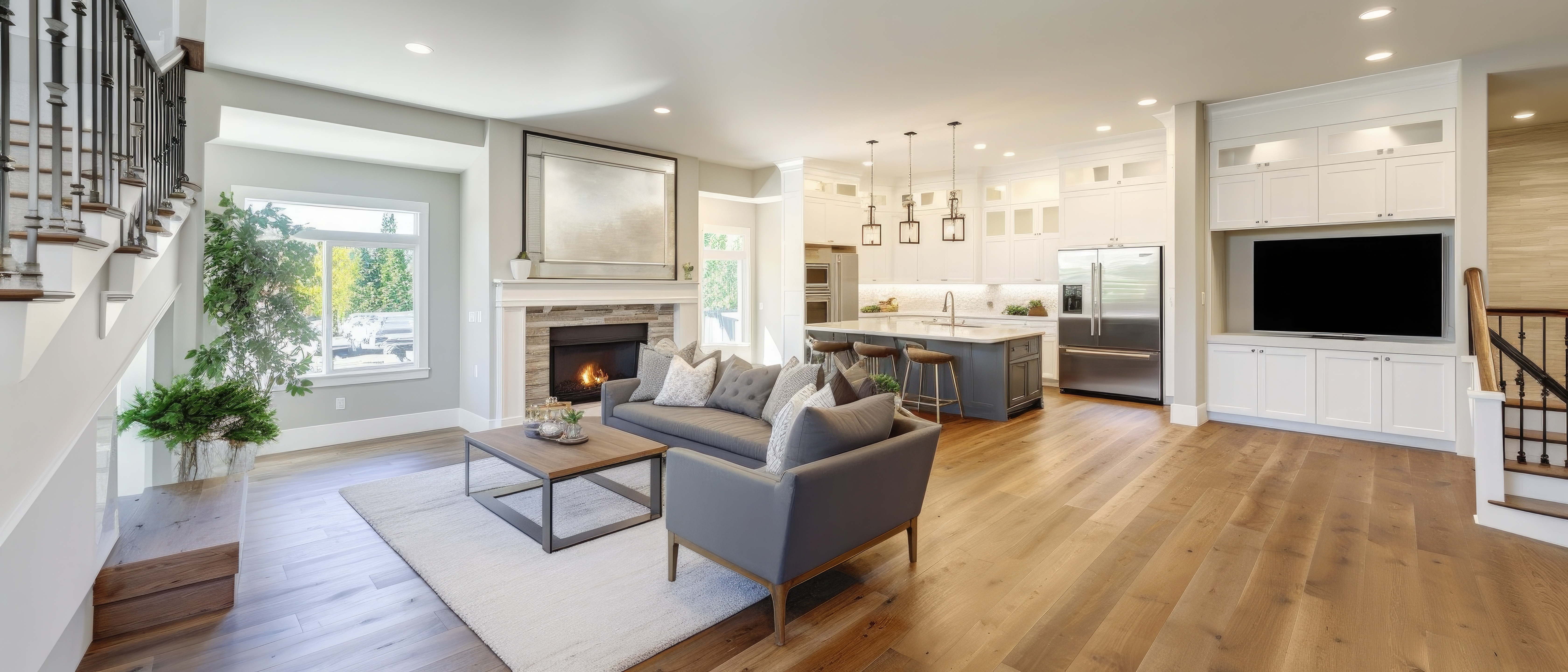
Clutter isn’t only objects. It’s also visual noise. The floor is your largest surface area, so its undertone + contrast + pattern scale can quietly magnify the sense of mess. When the floor fights your lighting or wall color, your brain reads it as “too much information,” especially at night when you’re tired and everything feels louder.
At Cozy Comfort Floors in Gulfport, MS, we guide customers through this all the time: two floors can be equally durable, but one makes a home feel calmer within 10 minutes of install.
Color temperature: warm, neutral, cool
People say “gray” or “beige,” but what matters is the undertone:
Warm undertones: yellow, honey, red-brown
Cool undertones: blue, green, violet-gray
Neutral undertones: balanced, “greige,” soft taupe
Here’s the technical trick: your lighting has a temperature too.
2700K–3000K (warm) pulls warm tones forward and can make cool floors look dull or slightly “green.”
3500K–4000K (neutral-cool) can make warm floors read yellow/orange, and makes dust more visible.
5000K (daylight) increases contrast and exposes everything.
If your floor undertone clashes with your light temperature, the floor looks “off,” and visual discomfort registers as clutter.
The clutter multiplier formula
These factors increase perceived mess:
High contrast patterning
Busy wood grain with strong dark/light variation reads like constant movement. You’ll notice crumbs, toys, and cords more because the floor already looks “active.”Wrong scale of pattern
Small, repetitive patterns can create a “static” effect. Large, calm variation usually reads quieter.Cool gray floors with warm walls (or vice versa)
This creates a constant undertone fight. Your eye keeps re-checking the mismatch, like background tension.Shiny surfaces under LED downlights
Gloss adds reflections. Reflections add “movement.” Movement reads like disorder.
What actually makes a room feel cleaner
1) Mid-tone neutrals with low contrast movement
Think soft oak, light warm taupe, or gentle stone-look. Mid-tones also hide daily dust better than very dark or very white floors.
2) Matte or low-sheen finishes
Lower sheen reduces specular highlights, meaning fewer “streak signals” and less visual chaos.
3) Grout color selection that doesn’t shout
For tile: avoid extreme contrast grout unless you want graphic lines. A grout tone close to tile color makes the grid disappear, which feels calmer.
4) Transition consistency
If every room changes floor tone sharply, the house feels fragmented. Consistent tone across spaces feels organized.
Gulf Coast realities: sand, humidity, and lighting habits
On the Mississippi Gulf Coast, fine sand and outdoor traffic are common. Floors that are:
too dark (show dust)
too shiny (show streaks)
too cool under warm LEDs
…tend to feel messy faster, even when maintained.
A calmer, “always tidy” look usually comes from matte finishes and balanced undertones that match your bulb temperature.
If your home feels visually busy and you can’t figure out why, the floor might be doing more “clutter work” than your shelves ever did. Choosing the right undertone, sheen, and pattern scale can make your space feel calmer without changing your lifestyle.
Visit us or contact Cozy Comfort Floors in Gulfport, MS for help choosing laminate or tile that matches your lighting and makes your home feel effortlessly put together. We serve Gulfport, Biloxi, Ocean Springs, D’Iberville, Long Beach, Pass Christian, Bay St. Louis, Waveland, Diamondhead, and the entire Mississippi Gulf Coast.


